How to Choose the Right Color Schemes for Your Custom Notebook Designs
Introduction
Choosing the right color schemes for custom notebook designs is crucial for creating visually appealing products that resonate with your target audience. As a seasoned expert in custom notebook printing, I will guide you through the essential steps to select the perfect colors. This comprehensive guide will help you understand how color choices can impact your brand’s identity and customer appeal.
Table of Contents
- Introduction
- Understand Your Brand Identity
- Research Your Target Audience
- Use Color Psychology
- Consider Color Harmony
- Keep It Simple
- Test Your Color Choices
- Stay Updated with Trends
- Consider Cultural Connotations
- Use Color to Enhance Functionality
- Seek Professional Advice
- Related Questions and Answers
- Buying Guide
- Conclusion
Understand Your Brand Identity
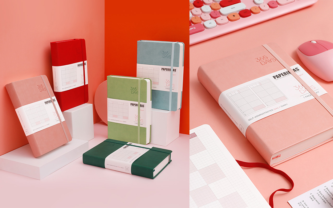
To choose the right color scheme for your custom notebook designs, start by understanding your brand identity. Your colors should reflect your brand’s personality and values. For instance, if your brand exudes professionalism and sophistication, consider using black, navy blue, or gray. For a more youthful and energetic brand, vibrant colors like orange, yellow, and pink may be more appropriate. Knowing your brand inside out helps ensure that your color choices align with your overall brand strategy. This approach is essential for creating custom notebooks, personalized notebooks, and custom journals that truly represent your brand.
Research Your Target Audience
It’s crucial to consider your target audience when selecting colors. Different colors evoke different emotions and reactions. For example, if your target market is young students, bright and playful colors might be more appealing. On the other hand, if you’re targeting professionals, more muted and classic colors may be better suited. Conduct market research to understand the color preferences of your target audience and use this data to inform your decisions. This ensures your custom printed notebooks and branded notebooks will attract the right customers.
Use Color Psychology
Color psychology plays a significant role in design. Each color evokes specific feelings and reactions. Blue is often associated with trust and calmness, while red can evoke excitement and urgency. Understanding these associations can help you choose colors that elicit the desired response from your customers. For instance, using green might suggest sustainability, making it ideal for eco-friendly notebook lines. Incorporating these insights into your custom notebook designs will make your products more appealing.
Consider Color Harmony
Color harmony ensures that the colors you choose work well together and create a visually appealing design. There are several color harmony principles you can use, such as complementary, analogous, and triadic color schemes. Complementary colors are opposite each other on the color wheel and create a vibrant look. Analogous colors are next to each other and provide a more harmonious feel. Triadic schemes use three evenly spaced colors on the color wheel, offering a balanced yet colorful palette. This harmony is crucial for custom notebook printing services to deliver attractive products.
Keep It Simple
Sometimes, less is more. A simple color scheme can be more effective and aesthetically pleasing than a complex one. Limit your color palette to two or three main colors. This approach ensures that your design remains clean and uncluttered. It also makes it easier for your audience to focus on the key elements of your notebook design, enhancing its overall impact. This simplicity can be particularly effective for custom logo notebooks and custom leather notebooks.
Test Your Color Choices
Before finalizing your color scheme, test it in different contexts. Print a sample notebook and see how the colors look in natural light and under different artificial lighting conditions. Colors can appear differently on screens compared to print, so it’s essential to see the actual product. Additionally, gather feedback from a small group of your target audience to ensure the colors resonate well with them. This step is vital for custom notebook manufacturers to ensure high-quality custom notebooks.
Stay Updated with Trends
Color trends can influence consumer preferences. Stay updated with the latest color trends in design and fashion to ensure your notebooks remain relevant and appealing. However, it’s essential to balance trendiness with timelessness. While it’s good to incorporate trendy colors, your primary color scheme should still reflect your brand identity and have lasting appeal. This balance is key for custom notebook design and custom notebook wholesale.
Consider Cultural Connotations
Colors can have different meanings and connotations in different cultures. If you’re marketing your notebooks internationally, be aware of these cultural differences. For example, while white is associated with purity in Western cultures, it can represent mourning in some Eastern cultures. Understanding these nuances ensures that your color choices are appropriate and respectful, avoiding any potential cultural faux pas. This consideration is important for customizable notebooks and printed notebooks.
Use Color to Enhance Functionality
Beyond aesthetics, color can also enhance the functionality of your notebooks. For instance, using different colors for different sections or categories can help users organize their notes more effectively. Consider how color can add value to the user experience, making your notebooks not only visually appealing but also more practical and user-friendly. This approach is beneficial for custom logo printed notebooks and custom planners and notebooks.
Seek Professional Advice
If you’re unsure about your color choices, don’t hesitate to seek professional advice. Working with a graphic designer or a color consultant can provide you with expert insights and recommendations. They can help you create a cohesive and attractive color scheme that aligns with your brand and appeals to your target audience. Investing in professional advice can save you time and ensure your notebooks stand out in the market. This investment is worthwhile for a custom notebook printing company to maintain quality.
Related Questions and Answers
Q: How do I choose the right color scheme for my custom notebooks?
A: Start by understanding your brand identity and researching your target audience. Use color psychology to evoke desired emotions, consider color harmony, and keep your palette simple. Test your choices in various contexts and seek professional advice if needed.
Q: What are some popular color trends for notebooks?
A: Current trends include minimalist palettes, pastel shades, and eco-friendly greens. Staying updated with trends while maintaining your brand identity ensures your notebooks remain appealing.
Buying Guide
When choosing custom notebooks, consider the following:
- Brand Identity: Ensure the colors reflect your brand.
- Target Audience: Choose colors that appeal to your audience.
- Functionality: Colors should enhance usability.
- Quality: Opt for high-quality printing and materials.
- Customization: Look for a provider that offers a wide range of customization options.
Conclusion
Choosing the right color schemes for your custom notebook designs can significantly impact their success. By understanding your brand identity, researching your audience, using color psychology, and testing your choices, you can create visually appealing and effective notebooks. Stay updated with trends, consider cultural connotations, and seek professional advice to ensure your products stand out. With these tips, your custom notebooks will not only attract customers but also reinforce your brand’s identity.
Contact Us: Ms. Rimo Lau
Whatsapp: 0086 18336352791 – WeChat&Phone
Website: www.fullcolorprintstationery.com
E-Mail: [email protected]


